If you’ve recently installed or updated Android Studio and found yourself staring at an interface that looks noticeably different from every tutorial you’ve been following — you’re not imagining things. The Android Studio New UI is a real, meaningful redesign of the IDE’s layout, and it catches a lot of beginners off guard.
The toolbar looks different. Icons have moved. Some things that used to be labeled now show only symbols. The overall feel is cleaner and more modern, but “cleaner” doesn’t always mean “easier to navigate” — especially when you’re still learning where everything lives in the first place.
This guide explains what actually changed in the Android Studio New UI, how to switch between the new and classic layouts, which differences genuinely affect your daily workflow, and how to get comfortable with whichever version you end up using.
What Actually Changed in the Android Studio New UI
The Android Studio New UI isn’t just a fresh coat of paint. The layout has been meaningfully reorganized, drawing from design decisions made by JetBrains for their IntelliJ IDEA platform — the foundation that Android Studio is built on.
The most immediately noticeable change is in the toolbar area. The classic interface had a horizontal toolbar running across the top of the screen, with buttons for running your app, debugging, syncing Gradle, and more — all visible at once, always in the same place. The Android Studio New UI condenses this into a more minimal top bar, moving some actions to the right side and grouping others into compact icon clusters.
The side panels have changed significantly too. In the classic layout, tool windows along the left edge had clear text labels — you’d click “Project” to open the Project panel, “Build Variants” to switch build variants. In the Android Studio New UI, those labeled tabs are replaced with icons only. Cleaner, yes — but less immediately obvious for anyone who hasn’t memorized what each icon represents.
The color scheme and icon set are updated throughout as well, bringing Android Studio in line with modern IDE design trends across the JetBrains ecosystem.
Why the Android Studio New UI Exists
JetBrains redesigned the IntelliJ platform interface with one main goal: give more screen space to the actual code editor by reducing visual clutter around it. For developers working in large files or on smaller laptop screens, having more of the display dedicated to code rather than toolbars and labels makes a genuine difference.
The Android Studio New UI also performs slightly better on some systems because it renders fewer persistent UI elements at once. On a 13-inch laptop screen especially, the more compact layout is noticeably more comfortable.
Google began adopting this redesign into Android Studio starting with the Hedgehog release. By Ladybug — the 2026 version — the Android Studio New UI is the default and has matured into a stable, polished interface. If you’re installing Android Studio fresh in 2026, this is what you’ll see from the first launch.
How to Switch Back to the Classic UI
If the Android Studio New UI isn’t working for you — maybe you’re following a course recorded before 2023 and the interface looks completely different from your screen — switching back to the classic layout takes about thirty seconds.
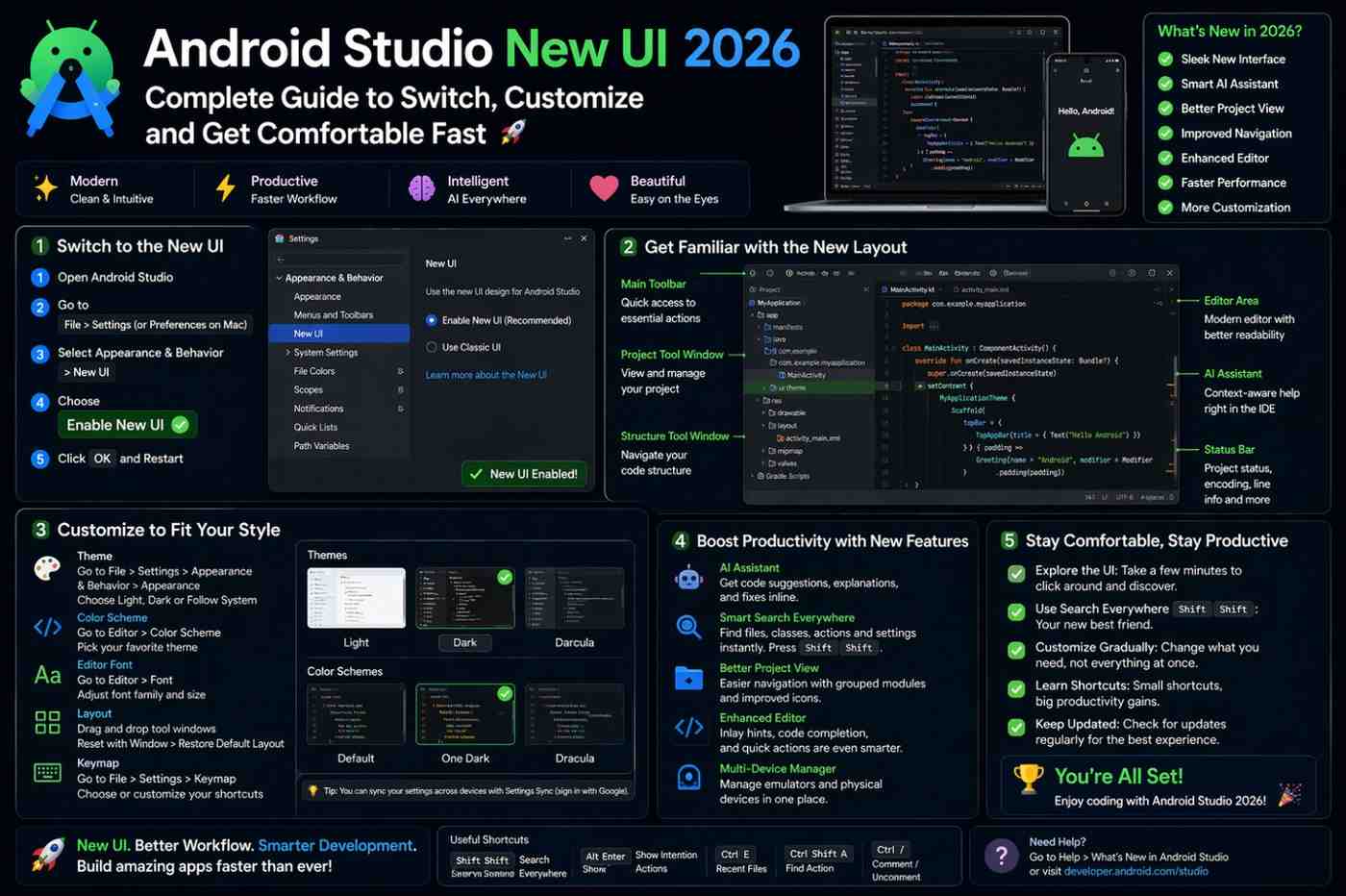
Go to Help → Find Action (keyboard shortcut: Ctrl+Shift+A on Windows/Linux, Cmd+Shift+A on Mac). Type “New UI” in the search bar. You’ll see an option called Enable New UI with a checkbox beside it.
Alternatively, navigate to Settings → Appearance & Behavior → New UI and find the toggle there.
Uncheck the option, restart Android Studio when prompted, and the classic interface is back. The same toggle re-enables the Android Studio New UI whenever you want to switch back. Your projects, settings, and configuration are completely unaffected by toggling the UI — nothing gets lost.
How to Enable the New UI If You’re Still on Classic
If your Android Studio is currently showing the classic interface and you want to try the Android Studio New UI, the same path works in reverse. Go to Settings → Appearance & Behavior → New UI and check the Enable New UI box. Restart when prompted.
In some versions, Android Studio shows a notification banner offering to enable the New UI automatically — clicking Try in that banner starts the same process without needing to dig through settings.
Key Differences That Actually Affect Your Workflow
The Run and Debug Buttons
In the classic UI, the run/debug configuration selector and the green Play button sit prominently in the toolbar — always visible, always in the same spot. In the Android Studio New UI, these controls are still in the top bar but styled quite differently. The configuration name is displayed more subtly, and the Run and Debug buttons use updated icons that don’t look like the ones in most beginner tutorials.
This is the most disorienting change for new developers. If you’re hunting for the green Play button and can’t find it, hover over the icons in the upper-right area of the editor. It’s there — it just looks different now. Give it one session and the new location becomes second nature.
Tool Window Access
Finding Your Panels in the Android Studio New UI
As mentioned earlier, tool windows in the Android Studio New UI are icon-only by default. No text labels along the edges — just symbols. For beginners who haven’t memorized the icons yet, this creates friction.
The practical fix is simple: hover over any icon along the edges of the IDE and a tooltip appears explaining what it opens. Most developers have the common ones memorized within a week of regular use.
If you genuinely prefer text labels, you don’t have to live without them. Right-click on the tool window bar and select Show Tool Window Names. This re-adds text labels to the Android Studio New UI without switching back to the classic layout entirely — giving you the cleaner design with the navigability of the old one.
Finding the Settings Menu
The classic UI puts Settings under File → Settings. The Android Studio New UI moves Settings access to a gear icon in the bottom-left corner of the IDE. This trips up almost everyone the first time.
If you can’t find Settings, look at the very bottom-left of the window for the gear icon. Or skip the searching entirely and use the keyboard shortcut: Ctrl+Alt+S on Windows/Linux, Cmd+, on Mac. That shortcut works in both UI versions and is worth memorizing regardless.
Which UI Should You Actually Use?
There’s no single right answer here, but the honest practical take is this:
Use the Android Studio New UI if you’re starting fresh in 2026. It’s the direction Android Studio is heading long-term, and learning it now means less adjustment later. It’s also genuinely better on smaller screens and looks more professional for screen sharing.
Use the Classic UI if you’re working through video courses or tutorials recorded before 2023, or if your team uses the classic layout and you need consistent reference points during pair programming and screensharing sessions.
The good news is you can switch freely. Android Studio doesn’t care how many times you toggle between the two. Experiment with both over a week and see which one actually fits how you work.
Customizing the Android Studio New UI
One option that doesn’t get mentioned enough: you don’t have to choose between the Android Studio New UI exactly as it ships and the full classic layout. You can customize it.
Right-click on the toolbar or tool window bars to add or remove items. You can bring back specific classic-style elements — like more visible run controls or labeled tool windows — while keeping the cleaner overall aesthetic of the new interface.
Spending fifteen minutes configuring the Android Studio New UI to match your preferences gives you the best of both worlds. Most of the classic layout elements can be made visible in the new interface with a few small adjustments.
Getting Comfortable Faster
The real barrier to adopting the Android Studio New UI isn’t capability — every feature from the classic layout is still present. It’s just unfamiliarity. Things have moved, and your muscle memory keeps sending you to the wrong spots.
The fastest way through this: pick one focused session, commit to staying in the Android Studio New UI, and resist switching back. Open the Project panel, find Logcat, run an app, check the Build output, open Settings. Work through the core actions deliberately. Most of the confusion clears up within an hour of intentional use.
For tracking down specific features that moved between versions, the official Android Studio release notes document exactly what changed in each release — a useful reference when something you relied on seems to have disappeared.
You can also explore the IntelliJ New UI documentation since Android Studio’s interface changes are rooted in the same JetBrains redesign — and a lot of the customization options documented there apply directly.
Final Conclusion
The Android Studio New UI is a cleaner, more focused development environment — and it’s clearly where Android Studio is heading for the long term. The classic interface remains fully accessible for anyone who prefers it or needs consistency with older learning materials. Switching between the two takes about thirty seconds and affects nothing about your actual projects.
What matters most isn’t which version you pick. It’s getting comfortable enough with your environment that the IDE stops feeling like an obstacle and starts feeling like a proper workspace. Whether you stay with the Android Studio New UI, switch back to classic, or customize something in between — spend a little time getting oriented, and the interface will stop being the thing you’re thinking about.